Showing posts with label Research. Show all posts

Wednesday, 21 September 2016

Research on the XX


The XX target audience and public awareness

The reason why I’ve decided to use the XX's song 'Night Time', is because it advertises young bands emerging into the music scene and their music is generally very relatable and true to life. Indie music describes the major concerns of people. In order to create a music video based on my genre I need to understand who my main target audience is by researching who appreciates the music and in particular, who connects and relates to it.

My target audiences for my media product is mainly for ages 17-24 years old. This is because the music is relatable to teenagers who turn to music as a source of comfort whilst going through relationship problems. Many indie tracks are a narrative based story which discuss past relationships and poignant life events, they are easily relatable to peoples lives. 

The XX have had a significant amount of articles written about them in well-known newspapers and magazines. This shows they have a large hold on the music industry and continue to influence. They are well reported about as well. The Guardian newspaper targets a well-educated, relatively young, predominantly male and liberal audience, the main target audience of the XX, and newspapers such as the telegraph have said how adaptable their music is, and how important they are to the development of Indie music.
Specifically, on the bands website there is a community blog and a merchandise store. The blogs advertise events which fund themselves through the widespread attention they receive. This helped them advertise for the release of their most recent album, 'Coexist'. The website is vitally important because the majority of the XX's target audience are young and regularly use the internet to discover new music and genres. Additionally, many of the XX's songs are used for TV advertisement and background music for movies because of their mellow sound and adaptability. The XX make electronic-edged music that's ghostly and enigmatic. This resulted in massive recognition on screen because it was heard appearing on live TV. This meant people were made curious of its origins and background behind the music, making them completely different in the world of music.  



The XX released their new album by sending it to a small fan base who then sent the link on to fans all over the world through social media. Word of mouth aided the publication and people continued the trend cycle. Social media has helped them establish a target audience through constant advertisement and continual access and connections to their audience. Music downloading and social media have made the pre-release album stream an integral part of the modern music marketing scheme, and the XX have successfully drawn attention to themselves.


Record labels


Young Turks - 

An independent British record label, based in London. Founded in 2006 by Caius Pawson. The label owns other groups/artists like Jamie XX, Sampha, FKA Twigs, Koreless etc. The majority of their bands would be categorised under the alternative indie genre. 


XL Recordings - 

Image result for XL Recordings
 The record label are an English independent label founded in 1989 by Richard Russell. They own groups/artists such as Adele, The white stripes, Vampire Weekend, Dizzie Rascal, Låpsley etc. Due to the wide variety of bands, it is clear that the record label do not support a singular genre of music, unlike the 'Young Turks'.


Tuesday, 20 September 2016

Digipack analyses


WHAT IS A DIGIPACK?

Dictionary definition: a type of packaging for CDs or DVDs, typically made from cardboard with an internal plastic holder for one or more discs.

I have chosen to deconstruct digipacks which link with our chosen genre of 'indie pop/rock', this will enable me to gather a good understanding of what type of styling our digipack and poster should follow. Understanding the right codes and conventions of a digipack of your genre needs, plays a significant part when trying to advertise the product and the band itself.


Below is a clear diagram found on Google images of a basic digipack template:


As you can see, a basic digipack consists of 4 panels, one being the front where the bands logo and title, along with an image of some sort will be presented. The second panel after opening the pack is the CD slot, where the bands/artists official CD will be located. Next we have the inside panel where the tracks or contextual information about the band may be displayed. Lastly, we have the back panel, often this panel provides an image and the record label.


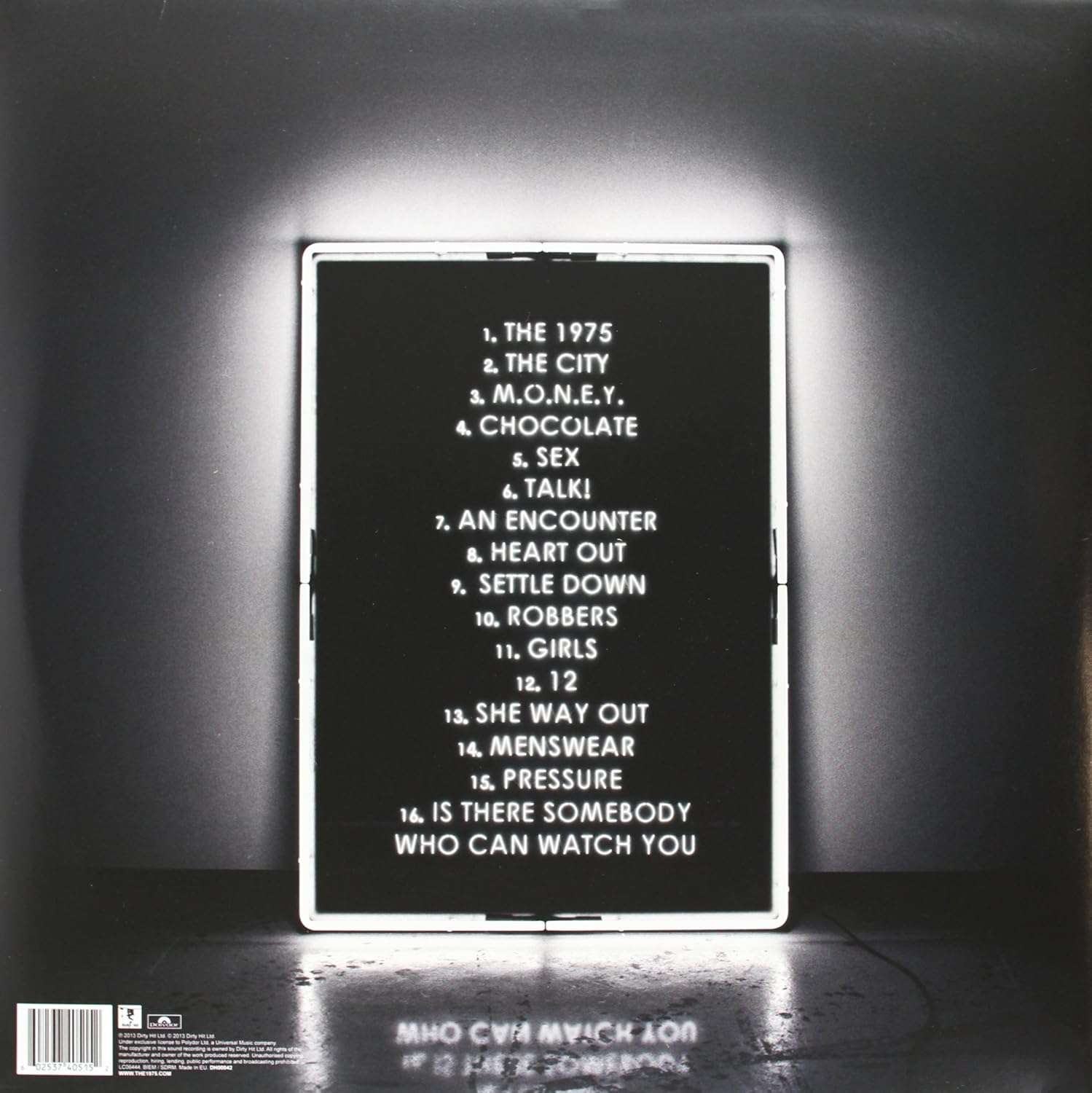
The 1975's front panel to their digipack has a basic design which reoccurs in a few of their videos, for example in the music promo 'Girls' there are lights which glow around the band's logo, along with a frame similar to the albums which outlines the musicians as they perform. The black and white theme links with the time period of their title '1975' and adds a sense of mystery as the time period contrasts against their generation of music. The edgy style reflects their pop indie genre perfectly.


Image result for 1975 digipak inside panel


The inside panel provides information about the record labels and companies which contributed towards the production of the album. It is important that the digipack presents this information early on within the pack, as it highlights the fact that the band are authentic and have reached professional industry standards. The white font nicely contrasts against the black background, allowing the context to stand out clear and formally. The text is aligned central to the panel, this gives a similar effect to the layout of most credits and therefore emphasises the formality of the band.

Image result for 1975 digipak cd


The albums CD is rather bland. The title is in a black font, which against the grey background, does not stand out. Perhaps the designer has created this to generate a sense of intrigue. 


Image result for 1975 digipak cd back


The back panel presents an entire listing of the tracks, once again the font stands clear against the black background, the reflection of the frame on the ground could possibly resemble how the feelings within one side of the relationship, are mirrored onto the partner. The black and white effect creates this edgy look which link with the pop/indie genre of the band. 

Monday, 19 September 2016


Analysing different types of digipacks


Coldplay's 'Viva La Vida' was released on the 12th of June 2008. 'Viva La Vida' meaning 'Live the life'. 

This digipak particularly appeals to me as for the mixture of different colour tones and fonts. The pack is informative as it supplies the viewer with the a constructive list of tracks, alongside captivating images which gives you an insight into the overall success of the band. 

The front displays the albums title of 'Viva La Vida' which is overlaying a vintage styled background which consists of what seems to be the French perhaps celebrating victory.
The whitish font is ever so slightly transparent and seems as if it has been printed with a type of graffiti paint. The combination of vintage history (the french revolution) and modern styling really helps to resemble the bands uniqueness which is present throughout their tracks. The french flag is clearly being waved high and proud, this historical context gathered from the front panel, gives us a rough idea about the meanings behind their tracks.
The second panel provides four shots taken from a few of their performances on tour. Having snippets from previous tours highlights the success of the band and reassures the buyer that the album is appreciated and trusted by thousands. The colouring of the guitarist in this panel compliments the front cover, for example a red light mirrors the vibrancy of the red stripe on the French flag. A shot of the guitarist  photographed in black and white resembles the harsh shadows occurring around the edges of the front panel. Lastly, the drummers saturated yellow top enhances the creamy light colours noticeable in the background. All band members are to be identified on this panel, i believe that the purpose of this is to highlight the fact that they are a group which rely upon each other to deliver spectacular albums.

The third panelling is entitled ' Coldplay, Viva La Vida, or death and all of his friends'. The text is formatted in a vivid yellow font which significantly stands strong agains the grey background. By sustaining a simplistic effect, the viewers are led to delve deeper by possibly making a purchase or carrying out research online about the album itself. 

The back panel which presents the albums barcode supplies a list of the tracks. The tracks are neatly lined one after the other which contrasts against the chaotic art on the front panel. Creating a contrast allows the viewer to question the band and their intentions inside. 


Digipack analyses - Two door cinema club


Two door cinema club - 'Tourist History'

'The two door cinema club' released a digipack for their 'Tourist History' album. The first panel of the pack presents their band name in the foreground, and in the background a graphic art piece is layered. The title of the band is in a white font, which consists of bold and thin lettering. The purpose of the different styling of font is to allow the viewer to focus on the image behind the text. The image is of a greyish coloured cat with piercing green eyes, the cat seems to be wearing a golden party hat. The quirky graphic almost mirrors the unexpected, yet relatable lyrics the band deliver, enticing their young audience. The overall colouring of the cover is quite vintage, the dull purple/blue balance of colours ties in with the title of the album 'Tourist History'. Having the bands name in a large font size, will result in higher amount of sells as it stands out clearly.

The inside panel contains a list of the albums tracks, the unique font makes reading the songs rather difficult and therefore encourages the viewer to take a closer look and perhaps investigate into the genre of the band. The greyish background is similar to the albums front panel, havinng a colour coordinated album is often more appealing to the eye. The bluish font could be steretypical to the male gender, not restricting women from listening to their music, but instead higlighting the fact that they're a boy band. 

The albums CD is a traditional CD style , however to partner the indie genre of the band, the designer has designed a smudge print of cat eyes which is printed either side of the positioned hole. The imperfect print suggests that their music has a chilled, almost relaxed vibe. The title of the band is listed below the hole, just above the albums official title. The printing of the eyes depicts a personal sense, a feeling that the songs may be overlooking of the life of another or even reviewing. 

The back panel is once again exactly the same as the front, however this time there is the absence of text. The artist may have decided to use this panel design twice as the front cover prevents the audience from fully appreciating the graphic, as it is overlaid with a bold fancy font .


Image result for two door cinema club digipak
Image of 'Two door Cinema Club' digipack, found on google images


Foster the People digipack analyses


The front panel of their digipack “Torches” has an animated image of quirky looking creatures holding torches, which is presumably their logo resembling their band. The background is white which portrays connotations of 'purity' which strangely juxtaposes one of their songs 'pumped up kicks' which discusses murder. Perhaps the flamed torches are purposeful for depicting signs of danger. The flames are reflecting a glow effect onto their faces, a few of the animations appear to be ghosts, so perhaps the animation is suggesting ideas of enlightenment within the tracks. The cartoons are hand sketched which mirrors the creativite mind of thinking which is noticeable within their tracks. The assortment of strange looking characters are sketched in black and white, possibly relating to the bands name 'Foster the People' where by all styles, looks and types are accepted and therefore unite as one. 

Image result for foster the people torches digipak
Image was found whilst researching the bands album on Google image

The inside panel contains the song listing of the album, the fiery orange colour theme continues throughout, as the tracks are coloured orange. The orange font against the white background creates a contemporary effect, which is also rather refreshing, resembling the nuance of this genre of music. The choice of colouring is gender neutral, suggesting that the band aim to appeal to both male and female audiences. This way of styling will broaden their acceptance between both genders.  The alignment of the text is once again similar to the positioning of credits at the end of a film. The signed record labels are located underneath the tracks, their appearance within the digipack confirms the bands authenticity. 

The bright orange colour which accents the album cover is used in its entirety for the CD. This may be because the CD itself is the source of excitement/entertainment within the pack, therefore the most bold colour is the obvious choice to enhance this. 

The back panel is exactly the same as the front, maybe this panel is repeated to super enhance the message of the bands name which is 'Foster the People'. The individually designed characters are typically related to indie styling, as they are unique designs. 

Sunday, 18 September 2016

Gengahr Poster Analysis

Gengahr Poster Analysis


1975 - Poster Analysis

1975- Poster Analysis

Foster the People - Poster Analysis


Foster the people - Poster Analysis

                     
This poster is advertising 'Foster the peoples' event in Brooklyn, New York. The styling of their poster resembles their genre of music 'indie pop', as their quirky design represents the individuality of the band members. I presume that the three faces are members of the band and their fans would be capable of identifying the individuals from their face shape, hairstyle and whether they feature in their promos wearing accessories like glasses. The stars formed in the background could symbolise a sense of unconsciousness or dreaminess. This could resemble a few of their songs, as in their top seller 'Pumped Up Kicks' the young boy planning to kill his fellow class mates seems slightly psychotic and chooses to fantasy over his idea and the power he feels before taking action. The artsy patterns may be meaningful to a particular styling or culture, it almost helps to develop the 'indie' music as they're contributing their uniqueness to the genre. The choice of colours are gender neutral as the artist has contributed both blues and shades of pinks/purples into the poster. This clearly shows that they are not willing to restrict a particular gender to listen to their music.

Wednesday, 31 August 2016

Preliminary task - 'I know' Tom Odell music video recreation

Preliminary Task (Recreating a Music Promo - mastering lip syncing)


Here is my AS preliminary task, the task was to recreate a music video. I chose to recreate Tom Odell's 'I know' music promo. This project gave us the chance to practice mastering lip syncing. In order to perfectly match the song with the lip movement, we played the track in the actors pocket so they could clearly hear the lyrics and connect with the timing of the song. The video was edited on Final Cut Pro. At times we had to change the speed duration of our videos to match the song lyrics. Overall I thought this was a very exciting task as it enabled us to experiment using the software for music editing, and practice the art of lip syncing.