Showing posts with label Post Production. Show all posts

Tuesday, 20 December 2016

Magazine Advertisement


We decided to exclude the written song titles, as we though that it made the advertisement too cluttered.


Shown below are some images I took when trying to achieve the background for our magazine advertisement. I used my Canon 700D in order to capture visibly pleasing images. For a few of the shots I placed the rose petals in a clear bowl filled with water. I thought this was rather effective, it allowed the redness of the petals to appear saturated and sharpened.





Audience Feedback: 
'Romina' - aged 18 - ' I like the graphics, the use of colour is eye catching and stands out.It is obvious that the purpose of the advertisement is to promote the album, this is due to the bold font. The album is very memorable which is very good, as i'd be able to identify it if I were elsewhere'. 
 'Memoona' -aged 18 -'I like the advertisement because it is bright and colourful, the text isn't to overloading so its easy to understand. The pictures are very abstract and allow the viewer to consider the type of music and meaning behind the release of the album'.

'Isabella' - aged 24 - I think the design is very effective and the overall red tones helps to engage the viewer. I love the contrast between the white and red colours, they compliment each other nicely'.


'Olivia' - aged 21 - I think this is a fantastic advertisement, it looks very professional as your choice of font type and your layout is spot on! The colour tones within the two XX's is really artistic, I love how you've put your own twist on things to fit with your chosen theme'.

Personal Reflection: Personally I am really pleased with our magazine advertisement. I feel as if the red overlay is so powerful, and links with the connotations of love we are trying to convey perfectly. The layout of our advertisement is very appealing, this is because we have carefully chosen the key features we wish to enhance and done so by increasing their size. I think the choice to not take screenshots from our video but to instead create an abstract design was a good decision made. Our music video is conceptually based for an indie genre, and I therefore think an original abstract advertisement really entices the viewer as their is an element on intrigue. The metaphorical use of the rose within the video is presented upon our advertisement. There is now synergy noticeable throughout our promotional package as the rose still remains to be a prominent feature. 

Monday, 19 December 2016

Digipak (Back panel)


Back panel of our digipak:

Above is our back panel for our digipak. To create synergy in our designs, we copied the same logo from the front panel but altered the colours to add a sense of uniqueness. After carrying out research of digipaks, we gathered a few ideas for our own. For example many displayed track names, the title of their album, the record label, a barcode and a website address. Therefore to produce an appealing yet informative back panel, we also included these features. As the roses are coloured an unusaul shade of blue, we realised that formatting the background a colour other than white would ruin our design, taking the focus away from the rose. Therefore, likewise to the front panel we kept the background a pure white colour. The font was once again transferred from the website (www.dafont.com), however this time we selected a different font for the track names. The font we chose was labelled 'ALIEN AND COWS', and we were especially drawn to it as for its quirkiness, the letterings are a mixture between thin and bold, therefore allowing capitals to stand vividly against lower case letters. We also decided to use this font as we thought we may have overused the 'Roman Italics' font on previous panels.

The first step was to import the rose logo onto a black document (with the same measurements as the previous panels). I altered the colours from red to blue by adjusting the colour balance in the control panel. As the roses were layered on top of each other, shadows were formed as the opacity levels were low on the roses sitting at the top. 
Applying the albums name was easy as I just copied the title layer from the front panel. We positioned the title in alignment with the roses to create a central piece. We both contributed ideas for the track names, we wished for the tracks to compliment our indie genre and reference feelings and emotions.

Track names:

NIGHT TIME

HELLO STRANGER

ONE OF THOSE DAYS

LOST 

MIDNIGHT

VINTAGE 

DARK SKIES 

We thought the track names looked strong against a white boarder as they seemed to disappear against the darkened purple petals.
Once all the track names were applied, we inserted the 'XL RECORDINGS' record label logo, a made-up website for our band titled 'WWW.DARKVELVET.CO.UK', and a barcode. All of these links and logos were positioned at the bottom of our panel to allow the viewer to pay full attention to our logo, track names and album name.

Digipak (inside panel)

Inside panel for our digipak (Next to CD panel)

Shown above is our inside panel for the digipak. The black and white effect compliments our indie genre, as it provides a sense of edginess to our advertisement. Indie bands such as 'The 1975' inspired us to carry out a black and white theme, this is because their advertisements and promotional packages are solidly black and white. This panel was edited on PHOTOSHOP CS6 and took roughly 30mins to complete. The image was taken whilst my partner carried out test shots on the first day of filming. In the editing process we decided to leave the roses in colour as it persuades our audience to familiarise themselves with the symbolic rose and consider its purpose. Having our actress 'Tallulah' on a panel, informs our audience of our Star image which plays a significant role within our promo. We selected a shot of Tallulah looking down at the roses instead of directly at the camera. Although we wish to promote our lead singer, we do not intend to steer away from our indie genre which displays band members in a discrete manner which is casual and cool.


Once we had selected the most effective image of our lead singer, we started editing. To convert the entire image (excluding the roses) to black and white, I used the quick selection tool to highlight the outline of the roses. The next step was to duplicate the original image labelling the copied layer (black and white layer). After I had copied the layer, I cut around the roses using the quick selection tool on the black and white layer and then pressed delete on the highlighted area. This meant that the coloured roses appeared visible on the black and white layer as a small window had be cut to view the background layer.


Further adjustments were made to define the girls facial features. For example, the contrast was increased creating deeper shadowing on her cheekbones and also on her eye makeup. I also darkened the brightness to make it see as if the image was photographed at night time. Therefore linking to the track we created a promo for 'NIGHT TIIME - BY THE XX'.

Digipak (CD panel)


CD Panel for our digipak:

Shown above is our CD panel for our digipak. We thought the rose would appear nicely on this panel as for its circular shape. The image of the rose was photographed whilst I recorded the roses decaying at home. The vivid colouring of the rose really helps to highlight the different layers of petals, as shadowing is present. We were initially planning on having the background white, however after experimenting with different shades of neutral colours we came to the conclusion that the blue complimented the red the most effectively. The blue background is effective as it doesn't clash with the red, and fortunately links to the nature references within our researched indie artefacts. The blueness reflects upon the references of nature as it is a rather 'sky blue' colour tone.

The first stage of editing for this panel was filling the background our chosen colour (blue). This was completed by simply searching for the right colour on google images, and then by dragging the image into a new layer on the document. We noted down the same length and width of the previous panels to make sure all panels were equal in size.
After the panel had be altered to the perfect size, we selected an image of a rose which fell during the time lapse. The lasso tool was helpful whilst removing the unwanted background from the image. Below are some screenshots of the process:
Here is the original image, this was taken on windows edge as there was perfect lighting.
Next I used the magic wand tool to remove the background. This tool is very easy to use at it recognises areas you may not need and cuts them out instantly.

This is a screenshot of the rose after the entire background had been deleted.
To finalise this panel we applied the same black boarders as the previous panels, and imported an outline of a CD slot. This was found on google images after researching ' CD layout'.

Thursday, 15 December 2016

Editing Process, 1st draft


First Draft:
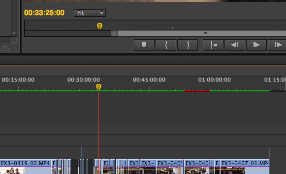
One of our major concerns which we had in the editing process, was the timing issue at the end of our promo. We planned to have the time-lapse of our rose decaying to the beat of the music, however as the clips of the roses were images, not videos the Software seemed to corrupt as soon as we placed images closely together. This resulted in the time-lapse appearing off-beat, therefore disrupting the flow of the video. Soon after many attempts trying to solve this issue. We came to the realisation that we had not rendered our video. After rendering our promo our video was perfectly in-sync with the audio, this allowed us to proceed with colour grading the promo.

Image result for rendering adobe premiere
Example Image found on Google: If the bar is green it means that the video is rendered, however the parts
which appear in red need to be selected and rendered in order for the video to proceed in a high definition quality, without frequent timing issues.

The Editing process

1st journal of our editing process:

To make sure our video was of a high quality and included purposeful vivid shots, we selected our clips carefully. The first step of this process was converting all of our clips into a folder which we categorised into three different folders which were titled, 'Tallulah shots', 'Joe shots' and 'Night Shots'. Having different files for our footage made editing an organised process as we didn't waste time opening each clip to see what it contained. 

Below is a screen shot of the folders we created:

Once we converted our clips into separate folders we began with the selection process. Shots which we eliminated included blurriness, unsteady movements, dull colouring, bad lighting, uneven framing and bad lip syncing. We decided to follow our animatronic which we had previously made in pre-production to make sure our storyline made sense, and to give ourselves a clear outline of the narrative we intended to follow. The next stage of editing was inserting our audio onto our timeline. The audio 'Night Time' by the XX was found on i-tunes. The audio was easily inserted onto our timeline by saving it to our 'music' folder and dragging the track into the project we had created.

The videos were inserted in the correct order before colour grading took place. The majority of our clips needed to be trimmed in size to either match the lyrics, or the overall pace of our video. To crop the duration of our clips, we used the razor tool to make accurate cuttings. If we had trouble making an accurate cut of the clip, the zoom tool would be used to see the clip size clearer. To move clips from one place to another, the select tool was used.

To make sure we didn't loose our work, we continued saving our piece every time we made an adjustment. We also decided to make numerous drafts of our video. This was a great idea, it allowed us to receive positive/negative comments from our target audience. This helped with the development of our production, as not only were we continuing to appeal to our target audience, but we were also making our promo a top quality video.