Thursday, 29 December 2016

Evaluation question 2: How effective is the combination of your main product and ancillary texts?


How effective is the combination of your main product and ancillary texts?


In order to create synergy throughout our production, we made sure to link our music promo to our ancillary texts. Before finalising any ideas for our promotional package, we researched indie bands and looked into how they created an effective link between their product and promotional resources. We noticed that many of the digipaks and promotional packages consisted of a logo or a pattern which represented the band/artist. It seemed to be a key theme for many bands to have a graphic illustration which could possible appear throughout their promos, promotional magazine advertisement and digipaks. The bands which use contemporary graphic illustrations are ' The xx' 'Arctic Monkeys' and 'Foster the People'. Show below are their digipak designs:

The Arctic Monkey's:
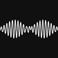


Here is the bands logo, it is a very iconic image for the band as it is featured throughout their music videos and promotional package many times. Its simplistic black and white colour choice, compliments the indie genre as there is a sense of edginess. The design looks similar to frequency waves. The up and down effect of the waves may be representative of the high and low points the band have experienced in their career. Or perhaps the high waves could resemble the upbeat songs throughout their album, many of their songs differ in pace so this would make sense if this is the message the band is trying to convey. 


Foster the People:


The band 'Foster the People' have continued to use graphic illustrations for their albums throughout many of their releases. Their designs are rather contemporary as for the basic yet effective images. As the band have not featured any members on their front panel, it suggests to me that each individual role within their band is not overlooked as they unite as one. The simplistic white background which is present behind the illustrations allows the designs to stand out clearly and does not interfere with the colours within the prints. The font used for their titles is very straight and often differs in boldness. The simplicity of the font is once again representative of the contemporary designs.

The XX:


The XX was one of our main inspirations for our piece, Their conceptual based promos managed to go against the conventions of a stereotypical music video, yet still form a massive fan base following. Their front panel of their digipak is an 'X' accompanied with either a black or white background. Each time the band have released an album, the 'X' is displayed in a different colour, whether this may be black, white, blue or oil iridescent. Keeping a simplistic logo for each of their releases, creates recognition for their music as the familiarity of the 'X' is becoming more noticed by the public over time. The logo is also very effective as it advertises the bands name 'THE XX'. Once again the band are not featured on the promotional package, this seems to be a common theme for the indie bands. I believe that the reason for this is because the bands do not wish to create a star image , by posing on the front of each advertisement. Many bands may have this idea that if they were to feature themselves on the front of the advertisement, viewers would perhaps make a judgement of their label based on appearance rather than the music itself.

The importance of combining the ancillary texts to our main product:

- By researching into bands promotional packages, we discovered the significance of forming a link between the ancillary texts and the main product. Forming this link is a perfect advertisement strategy. It enforces the bands recognition as there is more content being released to help sell the album.

- Using designs in my promotional material similar to my video helps to enforce the identity of the band.

- Creating synergy throughout the promotional package will entice the viewer as content will be clear. Without synergy, ones digipak and main product would fail to relate/link.

- Myself and my partner have managed to incorporate synergy into our piece. This has been carried out by the consideration of the metaphorical 'rose'. The rose is displayed in our music promo, as a metaphor for the characters relationship growing and decaying over time. To form an obvious link between our promo and ancillary texts, we decided to produce an appealing illustration of the rose for our digipak panels.


DIGIPAK FRONT PANEL

DIGIPACK INSIDE PANEL

DIGIPACK CD PANEL

DIGIPAK BACK PANEL


MAGAZINE ADVERTISEMENT 


Reflecting on our ancillary texts:

(DIGIPAK):-

- Overall, I think our digipak perfectly reflects upon our conceptual music video. Producing our own illustrations from photographic images taken at the time of filming, enhances the bands identity. The digipak visibly links towards the indie genre, the term 'indie' is a shortened version of the word 'independent', therefore I think that our unique designs compliment the originality of the indie genre.

- The variety of colours used create intrigue as although we have used multiple colours, the red has still remained prominent. The redness present within our digipak relates to the vivid roses in our promo. The choice of blue for our back panel, contradicts against the red as it alternatively offers a feeling of coolness.

- Whilst researching indie digipaks, we realised that to create a contemporary effect it was essential to incorporate a white background behind either the title, logo or pattern upon the panel. The colour white offers a sense of pureness to the panels, mainly due to its inability to interfere or clash with any other colours. On our back panel we inserted a white background to allow the viewer to appreciate the different tones of blueness within the rose design. Although the white colour is very effective, we did not wish to have all of our backgrounds the exact same colour. For our CD panel we had a large graphic rose to fill the CD outline. We discovered that a pale blue colour really helped to increase the redness of the rose and produce a natural effect. The sky blue colour against the deep red matched very effectively.

- The purpose for the diversity of the panels is to engage the viewer. After analysing other indie digipaks we noticed that each panel differed in colour in order to capture the viewer continuously. However it is still vital to form a link between each panel. For example each of our panels are different in colour and design, however we have still included the rose within each panel.

(MAGAZINE ADVERTISEMENT):-

- A magazine advertisement has the purpose of advertising the release of an album. Therefore it is vital that the advertisement is clear, appealing and relative to the albums release. To make sure we covered the main key features of a magazine advertisement, we made sure to display the bands name, the albums name, an image of the album releasing, the record label, and the release date, i.e 'OUT NOW', or 'OUT NEXT MONTH'.

- The rose once again has been featured. Now that the rose is displayed within the promo, digipak and magazine advertisement, it is clear that we have considered synergy. Similar font as the digipak has been used, font is very important to consider as it needs to produce clear recognition of the band for the potential buyers/listeners. Inserting the digipak image, assures the viewer that the album is genuine and also informs them of its appearance, in case they need to memorise the cover when they're in search of it online and in stores.

- Filtering our entire image in red is a real eye catching technique. Not only does it resemble the rose and its petals, but it also contradicts strongly against the strong black font, which creates a striking effect.


Audience Feedback: 

Question, ' Can you see a link between our ancillary texts and the final main product'?

Nicola - " I certainly can, the rose featured heavily throughout your video was a definite bright feature which made a point, therefore it linked strongly towards your digipak and poster. I also like the way you've used the rose in a symmetrical pattern in red and blue, producing an aesthetically pleasing piece of art".

Paul - " The rose was a memorable feature within the video so it seems an obvious choice to compliment the digipak and magazine advertisement with art work based on the rose design. I especially like how you have advertised the band name (THE XX) using your own design which works rather effectively".

Olivia - " I can see a clear link between the ancillary texts and the music video. The rose is a very prominent feature, and I think you've done a lovely job of incorporating it into your advertisement. The interesting design pattern you have created for your digipak, consists of blue and red colour tones. I believe this is a very sensible choice as it does not appeal to a particular gender, this will therefore increase your target audience".

Sam - " Yes the link between your promo and ancillary texts is very obvious to me. The rose is very eye catching as it is featured in different colours and shapes throughout your advertisements. The rose has a variety of different connotations, so I think it is a very good metaphorical object to use".


Wednesday, 28 December 2016

Evaluation question 1


In what ways does your media product use, develop or challenge forms and conventions of real media products?


Tuesday, 20 December 2016

Magazine Advertisement


We decided to exclude the written song titles, as we though that it made the advertisement too cluttered.


Shown below are some images I took when trying to achieve the background for our magazine advertisement. I used my Canon 700D in order to capture visibly pleasing images. For a few of the shots I placed the rose petals in a clear bowl filled with water. I thought this was rather effective, it allowed the redness of the petals to appear saturated and sharpened.


Audience Feedback: 
'Romina' - aged 18 - ' I like the graphics, the use of colour is eye catching and stands out.It is obvious that the purpose of the advertisement is to promote the album, this is due to the bold font. The album is very memorable which is very good, as i'd be able to identify it if I were elsewhere'. 
 'Memoona' -aged 18 -'I like the advertisement because it is bright and colourful, the text isn't to overloading so its easy to understand. The pictures are very abstract and allow the viewer to consider the type of music and meaning behind the release of the album'.

'Isabella' - aged 24 - I think the design is very effective and the overall red tones helps to engage the viewer. I love the contrast between the white and red colours, they compliment each other nicely'.


'Olivia' - aged 21 - I think this is a fantastic advertisement, it looks very professional as your choice of font type and your layout is spot on! The colour tones within the two XX's is really artistic, I love how you've put your own twist on things to fit with your chosen theme'.

Personal Reflection: Personally I am really pleased with our magazine advertisement. I feel as if the red overlay is so powerful, and links with the connotations of love we are trying to convey perfectly. The layout of our advertisement is very appealing, this is because we have carefully chosen the key features we wish to enhance and done so by increasing their size. I think the choice to not take screenshots from our video but to instead create an abstract design was a good decision made. Our music video is conceptually based for an indie genre, and I therefore think an original abstract advertisement really entices the viewer as their is an element on intrigue. The metaphorical use of the rose within the video is presented upon our advertisement. There is now synergy noticeable throughout our promotional package as the rose still remains to be a prominent feature. 

Monday, 19 December 2016

Digipak (Back panel)


Back panel of our digipak:

Above is our back panel for our digipak. To create synergy in our designs, we copied the same logo from the front panel but altered the colours to add a sense of uniqueness. After carrying out research of digipaks, we gathered a few ideas for our own. For example many displayed track names, the title of their album, the record label, a barcode and a website address. Therefore to produce an appealing yet informative back panel, we also included these features. As the roses are coloured an unusaul shade of blue, we realised that formatting the background a colour other than white would ruin our design, taking the focus away from the rose. Therefore, likewise to the front panel we kept the background a pure white colour. The font was once again transferred from the website (www.dafont.com), however this time we selected a different font for the track names. The font we chose was labelled 'ALIEN AND COWS', and we were especially drawn to it as for its quirkiness, the letterings are a mixture between thin and bold, therefore allowing capitals to stand vividly against lower case letters. We also decided to use this font as we thought we may have overused the 'Roman Italics' font on previous panels.

The first step was to import the rose logo onto a black document (with the same measurements as the previous panels). I altered the colours from red to blue by adjusting the colour balance in the control panel. As the roses were layered on top of each other, shadows were formed as the opacity levels were low on the roses sitting at the top. 
Applying the albums name was easy as I just copied the title layer from the front panel. We positioned the title in alignment with the roses to create a central piece. We both contributed ideas for the track names, we wished for the tracks to compliment our indie genre and reference feelings and emotions.

Track names:

NIGHT TIME

HELLO STRANGER

ONE OF THOSE DAYS

LOST 

MIDNIGHT

VINTAGE 

DARK SKIES 

We thought the track names looked strong against a white boarder as they seemed to disappear against the darkened purple petals.
Once all the track names were applied, we inserted the 'XL RECORDINGS' record label logo, a made-up website for our band titled 'WWW.DARKVELVET.CO.UK', and a barcode. All of these links and logos were positioned at the bottom of our panel to allow the viewer to pay full attention to our logo, track names and album name.

Digipak (inside panel)

Inside panel for our digipak (Next to CD panel)

Shown above is our inside panel for the digipak. The black and white effect compliments our indie genre, as it provides a sense of edginess to our advertisement. Indie bands such as 'The 1975' inspired us to carry out a black and white theme, this is because their advertisements and promotional packages are solidly black and white. This panel was edited on PHOTOSHOP CS6 and took roughly 30mins to complete. The image was taken whilst my partner carried out test shots on the first day of filming. In the editing process we decided to leave the roses in colour as it persuades our audience to familiarise themselves with the symbolic rose and consider its purpose. Having our actress 'Tallulah' on a panel, informs our audience of our Star image which plays a significant role within our promo. We selected a shot of Tallulah looking down at the roses instead of directly at the camera. Although we wish to promote our lead singer, we do not intend to steer away from our indie genre which displays band members in a discrete manner which is casual and cool.


Once we had selected the most effective image of our lead singer, we started editing. To convert the entire image (excluding the roses) to black and white, I used the quick selection tool to highlight the outline of the roses. The next step was to duplicate the original image labelling the copied layer (black and white layer). After I had copied the layer, I cut around the roses using the quick selection tool on the black and white layer and then pressed delete on the highlighted area. This meant that the coloured roses appeared visible on the black and white layer as a small window had be cut to view the background layer.


Further adjustments were made to define the girls facial features. For example, the contrast was increased creating deeper shadowing on her cheekbones and also on her eye makeup. I also darkened the brightness to make it see as if the image was photographed at night time. Therefore linking to the track we created a promo for 'NIGHT TIIME - BY THE XX'.

Digipak (CD panel)


CD Panel for our digipak:

Shown above is our CD panel for our digipak. We thought the rose would appear nicely on this panel as for its circular shape. The image of the rose was photographed whilst I recorded the roses decaying at home. The vivid colouring of the rose really helps to highlight the different layers of petals, as shadowing is present. We were initially planning on having the background white, however after experimenting with different shades of neutral colours we came to the conclusion that the blue complimented the red the most effectively. The blue background is effective as it doesn't clash with the red, and fortunately links to the nature references within our researched indie artefacts. The blueness reflects upon the references of nature as it is a rather 'sky blue' colour tone.

The first stage of editing for this panel was filling the background our chosen colour (blue). This was completed by simply searching for the right colour on google images, and then by dragging the image into a new layer on the document. We noted down the same length and width of the previous panels to make sure all panels were equal in size.
After the panel had be altered to the perfect size, we selected an image of a rose which fell during the time lapse. The lasso tool was helpful whilst removing the unwanted background from the image. Below are some screenshots of the process:
Here is the original image, this was taken on windows edge as there was perfect lighting.
Next I used the magic wand tool to remove the background. This tool is very easy to use at it recognises areas you may not need and cuts them out instantly.

This is a screenshot of the rose after the entire background had been deleted.
To finalise this panel we applied the same black boarders as the previous panels, and imported an outline of a CD slot. This was found on google images after researching ' CD layout'.

Thursday, 15 December 2016

Editing Process, 1st draft


First Draft:
One of our major concerns which we had in the editing process, was the timing issue at the end of our promo. We planned to have the time-lapse of our rose decaying to the beat of the music, however as the clips of the roses were images, not videos the Software seemed to corrupt as soon as we placed images closely together. This resulted in the time-lapse appearing off-beat, therefore disrupting the flow of the video. Soon after many attempts trying to solve this issue. We came to the realisation that we had not rendered our video. After rendering our promo our video was perfectly in-sync with the audio, this allowed us to proceed with colour grading the promo.

Image result for rendering adobe premiere
Example Image found on Google: If the bar is green it means that the video is rendered, however the parts
which appear in red need to be selected and rendered in order for the video to proceed in a high definition quality, without frequent timing issues.

Digipak


Shown above is the front panel of our digipak. We decided to feature our rose
within our digipak as a continuation from its appearance in our music promo.
The choice of 'red' is purposeful for creating connotations of love. The panel was designed on PHOTOSHOP CS6 and took around 1hr30mins to design. The roses displayed are photographs from the time lapse in my video. I have decided to create some darker faded roses to depict the negativity felt by the couples and the diminished life between the couple. Therefore the image is to represent the sense of love and love lost within the track. The debut albums name 'Dark Velvet' is presented in a roman italic font, which was found on the website (http://www.dafont.com). We took a liking to this font in particular, as its letterings are elegant however have a sharpened edge. This suits both genders, as it provides both elegance and an edgy seriousness. The white background contrasts nicely against the red roses. To allow the bands logo to stand vividly upon the panel, we thought 'white' would be the most appropriate colour as it is incapable of clashing or over shadowing different tones of colours.
Shown above is a screenshot from our editing process. At this stage I had selected the most effective image of the rose. Next I used the magic wand tool to remove the background, therefore leaving just the outline of the roses.  I originally only had one rose, so to make extra copies of the image I needed to duplicate. The duplication button was found by selecting:

1. LAYER (IN THE CONTRL PANEL)
2. DUPLICATE LAYER 
The font was imported directly from the website (http://www.dafont.com), by highlighting and dragging the font we wished to have. After I dropped the title into the document, I once again removed the background by using the magic wand tool.
To make our panel slightly more noticeable amongst others, we applied a black boarder from the controls panel. The black panel was originally a black square, however after using the transform controls in the upper left corner, we managed to stretch the shape to a similar sizing to an average boarder. To make sure all boarder were equal in shape and length, I duplicated the first layer by an extra 3. We of course had to credit the band 'THE XX' on out digipak. So we chose a font against a darkened boarder so there was clear recognition of the artist. 
The white background was applied to allow our logo to stand clearly. To apply this background we had to drag a white coloured square across panel, and make the layer the background layer. Making the background layer the 1st layer means that it will not cover or hide any of the other layers, and will always be visible.

The Editing process

1st journal of our editing process:

To make sure our video was of a high quality and included purposeful vivid shots, we selected our clips carefully. The first step of this process was converting all of our clips into a folder which we categorised into three different folders which were titled, 'Tallulah shots', 'Joe shots' and 'Night Shots'. Having different files for our footage made editing an organised process as we didn't waste time opening each clip to see what it contained. 

Below is a screen shot of the folders we created:

Once we converted our clips into separate folders we began with the selection process. Shots which we eliminated included blurriness, unsteady movements, dull colouring, bad lighting, uneven framing and bad lip syncing. We decided to follow our animatronic which we had previously made in pre-production to make sure our storyline made sense, and to give ourselves a clear outline of the narrative we intended to follow. The next stage of editing was inserting our audio onto our timeline. The audio 'Night Time' by the XX was found on i-tunes. The audio was easily inserted onto our timeline by saving it to our 'music' folder and dragging the track into the project we had created.

The videos were inserted in the correct order before colour grading took place. The majority of our clips needed to be trimmed in size to either match the lyrics, or the overall pace of our video. To crop the duration of our clips, we used the razor tool to make accurate cuttings. If we had trouble making an accurate cut of the clip, the zoom tool would be used to see the clip size clearer. To move clips from one place to another, the select tool was used.

To make sure we didn't loose our work, we continued saving our piece every time we made an adjustment. We also decided to make numerous drafts of our video. This was a great idea, it allowed us to receive positive/negative comments from our target audience. This helped with the development of our production, as not only were we continuing to appeal to our target audience, but we were also making our promo a top quality video. 

Filming day 2


Filming day 2 


The second day of filming was located at our school. Our actor Joe collected a visitors pass from the front office and met myself and my partner in the carpark. We filmed in front of the pull down white screen canvas in the art studio. The art room was booked a week in advance to make sure we didn't waste our actors time. With the help from our school IT specialist we set up a projector, which reflected scenes of nature and oil iridescent on the white canvas.

Reason for using the oil iridescent:
Image result for oil iridescent

Before filming we created a powerpoint together, the slideshow displayed the different scenes of nature we wished to present on the canvas. The slideshow took around 30mins to construct, this was because we had to consider which type of scenery would appear most effective and relate to our indie genre.


Before filming we created a powerpoint together, the slideshow displayed the different scenes of nature we wished to present on the canvas. The slideshow took around 30mins to construct, this was because we had to consider which type of scenery would appear most effective and relate to our indie genre.

We decided to use an oily pattern to reflect upon the canvas, as the mixed colours resemble the mixed emotions felt by the singers. The images we displayed were moving moving slowly in the background, this added a sense of intrigue to our video the images were slightly more atmospheric.                      

Overall todays filming went very well. Our actor 'Joe' performed amazingly which meant we were fortunately on schedule for time. The set consisted of a white backdrop and a wooden stool. We planned for our actor to sit on the stool whilst singing. The reason for this is to once again compliment our chosen genre. The majority of indie rock promos we had previously featured, consisted of a chilled/relaxed vibe.

Filming Journal


Image result for flowerz windsor
Image found on Google images 

First Day of Filming - 27th September

Today we filmed the first part of our video which only required our female actress 'Tallulah'. We arranged to meet outside Windsor Castle at 4.30pm. At this point of the day the lighting wasn't too dark, but we still wanted to proceed rather quickly as we were aware that the darkness would be drawing in around 5.15pm or so. After meeting Tallulah and my team member 'Bella'  we made our way down to our first location. Our first location was outside a flowers shop next to the Eton Bridge called 'FLOWERZ'. Filming outside the flower shop was a perfect idea, as the 'rose' is very symbolic within our video, resembling the possibility of love and the growth within their relationship. The variety of colours and different shades in the scene will help to produce a very appealing video which will attract our audience.  Just in front of this tiny shop sat a long bench which our actress sat on whilst singing her lines. To make sure Tallulah's lip singing was in time with the music and looks realistic, we played our song 'Night Time' and asked Tallulah to keep the music playing in her coat pocket. This meant that the music could be clearly heard and the phone would not be visible on screen.
After shooting the first few shots on the bench, we headed to the Eton bridge to capture Tallulah walking alongside the river. As we were shooting near the waters edge we made sure to protect the camera at all times, by keeping the lens cap on when we were just rehearsing. Due to the noise interference from the people passing by on boats and music from local restaurants, we had to film close to Tallulah to make sure her voice wasn't lost in the background sound.
Whilst Tallulah was learning her lines we made sure to make the most of the time we had, so we
filmed a few artistic shots of the swans which continued to fly past. These shots of the birds will link to our indie genre. Research gathered from our media artefacts suggests that the indie genre refers to nature as one of its main themes. Therefore including shots of the river and birds will hopefully engage our target audience.


Tuesday, 15 November 2016

Location Video

Shown below is our location scout video we previously filmed and edited. This video enables you to gather a brief understanding of the destination we plan to film at!

Monday, 31 October 2016

Alterations made to our storyboard

Alterations

After receiving the audience feedback from our pitch we have decided to alter the last minute of our video, instead of having our two actors simply walk past one another, we thought that having them sing by each other would be much more expressive. We shall either locate our ending scene on the bridge or on the roof top of an empty carpark. Both destinations are great to consider as for their scenic views. Making these few changes to our work will compliment our chosen 'concept' based video.

Benefits of filming on top of the carpark:

1) The top of the carpark is empty during the week, therefore we will have a large amount of space to film

2) The car park has the view of the Windsor Castle

3) We wont have the issue of having to seek permission from the public

4) It will add an urban feel to our music promo

Disadvantages of filming on top of the carpark:

1) If the lamp posts are not in use are shots will be too dark

2) To include the scenic views we will have to film mostly wide shots

3) If it rains there is no shelter


Benefits of filming on Eton Bridge:

1) The bridge is nicely lit so there wont be any issues when it comes to lighting

2) Very scenic as for the river, swans and busy atmosphere

3) Nice well known meeting point

4) Reliable destination as we have previously filmed there

Disadvantages of filming on Eton Bridge:

1) May need to seek permission from public

2) As there is a busy atmosphere we ay have difficulty listening to the music

3) Chance of bumping into members of the public

Friday, 14 October 2016

Risk Assessment

Presented below is the risk assessment for our day of filming

The first table considers the risk we may encounter in the Windsor/Eton Location, the second table displays the risks we are going to prevent in the art studio located at our school:

1)


2)

Thursday, 13 October 2016

Costume research

Costume:

For our music promo we decided to go for a casual clothing style. The purpose of this is to reflect upon the relaxed vibe of the indie/rock genre.

Below are our final choices for costume and makeup:

Joe dressed for filming


As you can see, Joe is dressed in a long black jumper with a gold chain overlaying. His jeans are a light blue faded colour with distinct rips on both legs. Overall we believe this look works well and links with our chosen genre 'indie rock' genre. The simplistic styling of our actors dress sense allows the audience to focus more on the meaning behind the lyrics, rather than the styling of his clothing.


Tallulah dressed for filming
Tallulah is also wearing a rather simplistic outfit, her ripped jeans are purposeful for matching Joe's edgy look. We hoped for Tallulah to have a warm feeling to her style, so we dressed her in an autumnal orange/brown winter jumper to create a romantic sense of warmth. The golden tones within her hair compliments her look and adds a glowing healthy touch to her skin tone.

Makeup and hair:


To compliment our romantic theme throughout our promo, we thought our actresses makeup should appear natural and slightly dewy. Going for a natural look would attract our target audience, as the star icon would seem youthful and therefore setting a good example to teenagers who may feel the need to cover up their insecurities. Tallulah's foundation is almost exactly the same shade as her skin

tone, it does not have a entirely matte finish which therefore produces a natural healthy glow. The autumnal eyeshadow contrasts beautifully against her big green eyes. A little amount of mascara defines the colour of her green eyes. We thought that our actress would suit a rose colour on her lips, to make them seem full and to deliver connotations of love and romance. Our actress wore her hair in a half-up half-down hairstyle flowing freely, so that the warm tones of her highlights complimented her warm glowing complexion.

Image result for highlighted half up half down hair


Wednesday, 12 October 2016

Digipak ideas:


For our digipak we intend to incorporate the rose into our panels. The rose within our video is symbolic towards feelings of romance and love, therefore using the rose as a method of advertisement will clearly link to the visuals and vocals of our piece. We wish to keep our panels simplistic to resemble the alternative instrumental. Below are a few test shots for our digipak, Joe is positioned in the centre of the white backdrop on the stool we are using for our promo. The unique lighting effect shown within a few of our sample images were achieved by the adjustment of the exposure setting on my Canon 700D. The lighting effect was actually accidental, however after reviewing our images in class, we realised that the lighting effect linked with our indie genre, and represented the quirkiness of the 'Nighttime' song lyrics. No alterations have been made to these images in post-editing, all images were purely captured on set with a few changes to the exposure and shutter speed in the settings mode: 


I have had a few different ideas for our poster design. As our promo incorporates the rose as a metaphor for romance, it would make sense to feature it within our poster and start to use it as a main source of promotion almost making it the symbol our band will be instantly recognised for.